6th OUBIC Bioinformatics Training Workshop
第6回OUBICバイオインフォマティクス講習会
- 日時 / Date & Time:2025年11月21日(金曜日) / Friday, November 21, 2025
- 【午前の部 / Morning Session】Colab入門+Python基礎 / Introduction to Colab + Python Basics:10:00–12:00
- 【午後の部 / Afternoon Session】データ可視化&統計検定入門 / Introduction to Data Visualization & Hypothesis Testing:13:30–16:40
- 形式 / Format:オンライン開催(Zoom) / Online (Zoom)
- 対象 / Audience:学内の学生および教職員 / Students and faculty members
- 言語 / Language:日本語 / Japanese
概要 / Overview
【午前の部】Colab入門+Python基礎
講師:山﨑 将太朗(バイオインフォマティクスセンター 生物情報解析分野RNA情報学グループ 准教授)
内容:「プログラミングとは何か」という基礎の基礎から、実際にコードを書く実習までを Google Colab で体験できます。インストール不要ですぐに始められます。AIを活用したプログラミングに関しても紹介します。
メッセージ: 初心者向けの内容ですので、プログラミング経験がなくても安心してご参加いただけます。プログラミング経験者は午後からのご参加でも大丈夫です。
事前準備:Google アカウント

【午後の部】データ可視化&統計検定入門
講師:山﨑 将太朗(バイオインフォマティクスセンター 生物情報解析分野RNA情報学グループ 准教授)
内容:Google Colab上でPythonを用い、データの可視化と統計検定を学びます。対象は、独立した数値データ、対応のある数値データ、およびカテゴリ(比率・頻度)データです。Excelでは作成しにくい図表の描画や、Excelの関数では対応できない統計検定を中心に取り上げます。
メッセージ: PythonとGoogle Colabによる解析の経験者のみ午後の部から参加可能とさせていただきます。 講習会の後半には、質疑応答や操作上のトラブル解決のための時間を十分に確保する予定です。そのため、講習の主要部分は16時40分よりも前に終了する見込みです。
事前準備:Google アカウント
資料・配布物 / Materials
- ポスター
- 【講義資料一式 / Complete set of lecture materials】
- 午前の部の講義資料 / Morning session lecture materials (machine-translated)
- 午後の部の講義資料 / Afternoon session lecture materials (machine-translated)
- 講習で使用した Google Colab ノートブックのリンク集 / Collection of links to the Google Colab notebooks used in the workshop (machine-translated)
- Note: Only the link list itself has been machine-translated. The Google Colab notebooks are available only in Japanese. However, you can use your browser’s translation feature.
※ これらの資料は将来的に削除させていただく可能性があります。予めご了承ください。
Note: These materials may be removed in the future. Thank you for your understanding.
目次 / Table of Contents
【午前の部】Colab入門+Python基礎
- Google Colabの紹介
- 【実習】さっそく解析してみよう!
- Pythonとは
- ChatGPT等のAIの活用のススメ
- 【実習】Python超入門
- 【実習】基本構文だけでできる"便利プログラム"
【午後の部】データ可視化&統計検定入門
- 値の分布の可視化
- 数値の変換
- Python と Excel の比較
- 【実習】Pythonで図を書いてみよう
- 統計検定
- 【実習】独立した数値データの可視化と統計検定
- 【実習】対応のある数値データの可視化と統計検定
- 【実習】カテゴリデータの可視化と統計検定
- 【おまけ実習】統計シミュレーター
- 【おまけ実習】より高度な作図
講習内容のサンプル / Sample Contents
注意事項 / Notes
- 一部の処理のみを切り出して掲載しているため、この記載内容だけでは意図通りに動きません。
- 掲載時の内容と、実際の講習会の内容が異なる場合があります。
- 実際の講習会では、これらの内容に先立ち、前提知識や環境設定に関する解説を行っています。
- あくまで記載内容の抜粋の紹介であり、仮に「コードを実行」などと書かれていても、この画面上で実際に実行できるものではありません。
- Since only selected parts of the workflow are shown here, this content will not work as intended on its own.
- The content shown here may differ from what is covered in the actual workshop.
- In the actual workshop, we provide explanations on prerequisite knowledge and environment setup before covering these materials.
- This page is only an excerpt for reference. Even if it says “run the code,” it cannot be executed directly on this page.
【午前の部】Colab入門+Python基礎
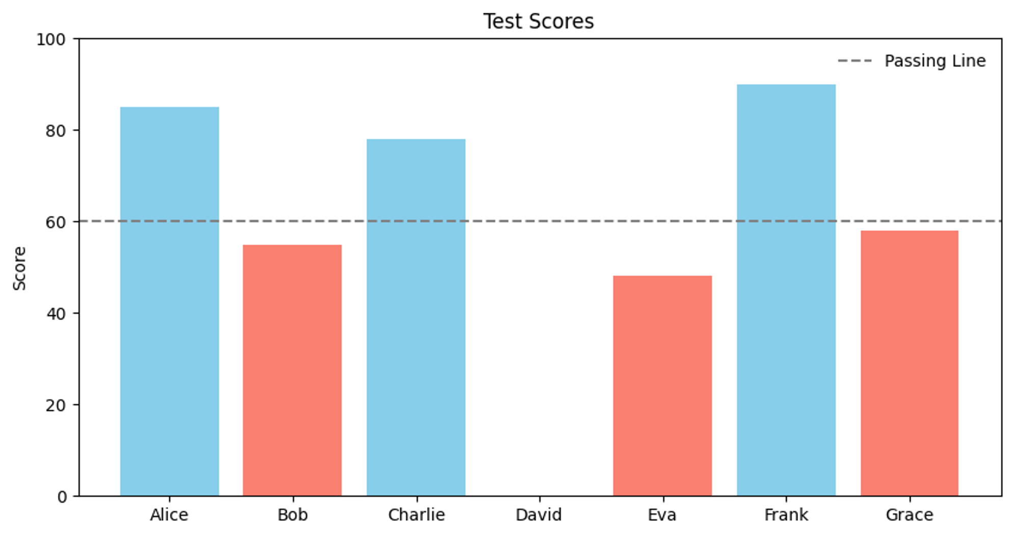
コード理解への挑戦(スタート)
あるクラスの生徒のテスト点数を、合否で色分けした棒グラフで表示するコードです。
以下の要素を含んでいます。
- コメント
- インポート
- 変数(数値、リスト、辞書)
- 関数
- 条件分岐
- ループ
まずは現時点でコードを読んでみてください。本資料では、このコードを読んで概要を理解できることを目標とします。
import matplotlib.pyplot as plt

# Define student scores as a dictionary
scores = {
    "Alice": 85,
    "Bob": 55,
    "Charlie": 78,
    "David": 0,
    "Eva": 48,
    "Frank": 90,
    "Grace": 58,
}

# Define passing score threshold
passing_score = 60

# Create empty lists to store data for each student
names = []
values = []
colors = []

# Loop through each student in the scores dictionary
for name, score in scores.items():

    # Add the student's name and score to the lists
    names.append(name)
    values.append(score)

    # Decide the bar color based on the passing score
    if score >= passing_score:
        # Pass
        colors.append("skyblue")
    else:
        # Fail
        colors.append("salmon")


# Create figure and axis
fig, ax = plt.subplots(figsize=(10, 5))

# Draw bar chart
ax.bar(names, values, color=colors)

# Title and labels
ax.set_title("Test Scores")
# ax.set_xlabel("Student")
ax.set_ylabel("Score")
ax.set_ylim(0, 100)

# Draw passing line using the threshold variable
ax.axhline(
    y=passing_score,
    color="gray",
    linestyle="--",
    label="Passing Line",
)

ax.legend(frameon=False)
plt.show()
プログラムが実行される順番
🧾 基本ルール:上から下に、順番に実行される
プログラムは、上から順番に1行ずつ読まれて、実行されていきます。
x = 5
y = 3
print(x + y)
このときの実行の流れはこうなります。
x = 5→ x という変数に 5 を入れるy = 3→ y という変数に 3 を入れるprint(x + y)→ x と y の合計(8)を表示する
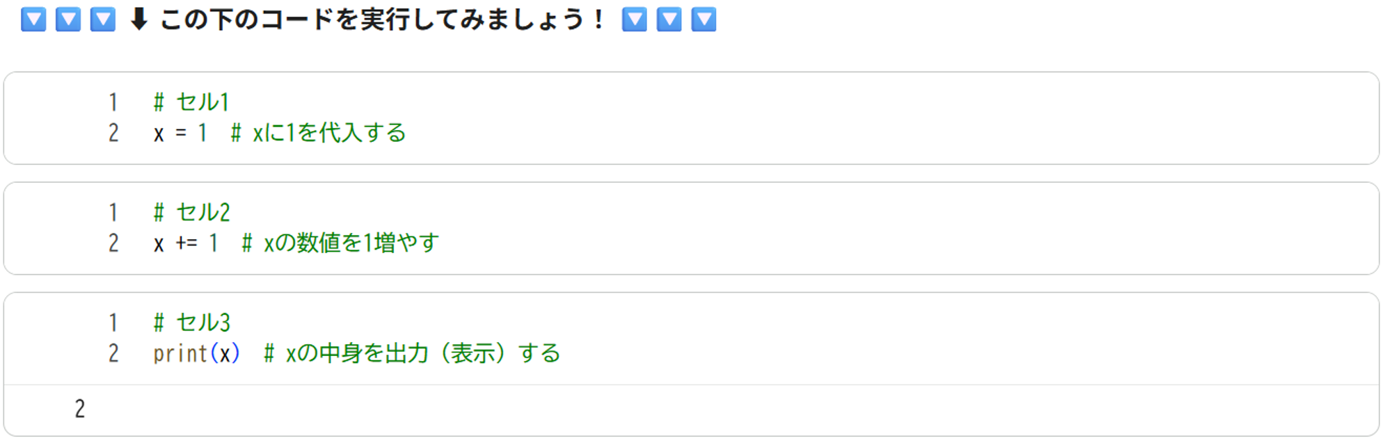
🧪 Google Colab のルール:セルごとに実行できる
Google Colab では、コードを「セル」というかたまりに分けて書きます。
そして、それぞれのセルをバラバラに実行することができます。
# セル1
x = 1  # xに1を代入する
# セル2
x += 1  # xの数値を1増やす
# セル3
print(x)  # xの中身を出力(表示)する
- セル1 を先に実行しておけば、セル2 と セル3 はうまく動きます(x = 1 が記憶されている)
- セル1 をスキップするとエラーになります(x の中身がまだ決まっていない)
- セル2 はスキップすることが可能です。セル3 では、スキップしない場合は 2 が、スキップした場合は 1 が出力されます。
- セル2 を複数回実行することが可能です。セル2 を実行した回数だけ、xの値は大きくなります。
- セル2 の後で セル1 を実行すると値が 1 に初期化されます。
基本的に、上から順番に1つずつセルが実行することが前提です。 セルを飛ばしたり、順番を入れ替えた場合、実行した場合、意図しないエラーや、誤った処理が行われる可能性が高いです。
【午後の部】データ可視化&統計検定入門
Figure / Axes / Axis の関係(matplotlibの基本構造)
Matplotlib では、図を構成する部品が階層的に分かれており、それぞれが明確な役割を持っています。 まずこの構造を理解しておくと、複雑な作図でも迷わずにコードを書けるようになります。
Figure
出力される「1枚の画像」全体を表します。
画像そのもの、いわばキャンバスに相当する部分です。 保存される PNG や PDF 1枚が、まさに Figure 1つに対応します。
Axes
データが実際に描画される「図の領域」です。
1つの Figure の中に、複数の Axes を配置できます。 サブプロット(2×2 など)を作る場合は、この Axes が複数存在します。 通常「グラフ」と呼んでいる部分が、この Axes にあたります。
Axis
Axes の内部にある “目盛り付きの軸” です。
x軸・y軸のスケールや範囲、目盛りの設定を担当します。 例えば set_xlim() や set_xticks() などは、この Axis に相当する設定です。
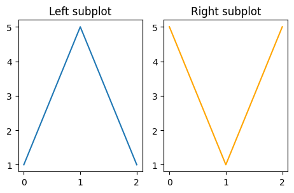
構造の例: サブプロットが複数ある場合
「1枚の画像に複数のグラフを並べる」ケースです。これは 1つの Figure に複数の Axes が存在する 状態です。各 Axes は独立しており、別々のデータを描けます。
import matplotlib.pyplot as plt

fig, axes = plt.subplots(1, 2, figsize=(12/2.54, 8/2.54))  # 横に2つ並べる

# 左のAxes
axes[0].plot([0, 1, 2], [1, 5, 1])
axes[0].set_title("Left subplot")

# 右のAxes
axes[1].plot([0, 1, 2], [5, 1, 5], color="orange")
axes[1].set_title("Right subplot")

fig.tight_layout()
plt.show()
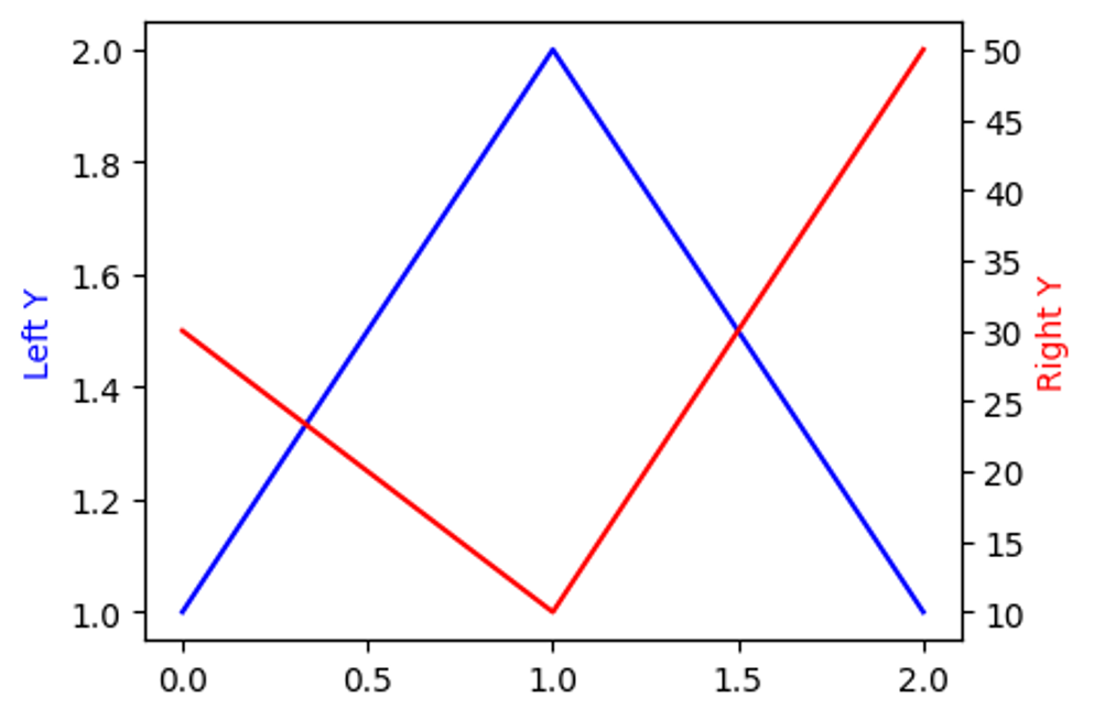
構造の例: 複数のスケールを持つ軸(例:左右で異なるY軸)
左右で異なるスケールの Y 軸を使う場合(twinx) は、同じ場所に重なった 2 つの Axes を使います。片方の Axes が左軸、もう片方が右軸を担当します。
import matplotlib.pyplot as plt

fig, ax_left = plt.subplots(figsize=(12/2.54, 8/2.54))

# 左軸にプロット
ax_left.plot([0, 1, 2], [1, 2, 1], color="blue", label="Left scale")
ax_left.set_ylabel("Left Y", color="blue")

# 右軸を追加(同じ場所に重なる2つ目のAxes)
ax_right = ax_left.twinx()
ax_right.plot([0, 1, 2], [30, 10, 50], color="red", label="Right scale")
ax_right.set_ylabel("Right Y", color="red")

fig.tight_layout()
plt.show()
構造の例: 同じ軸スケールで複数の種類のプロット
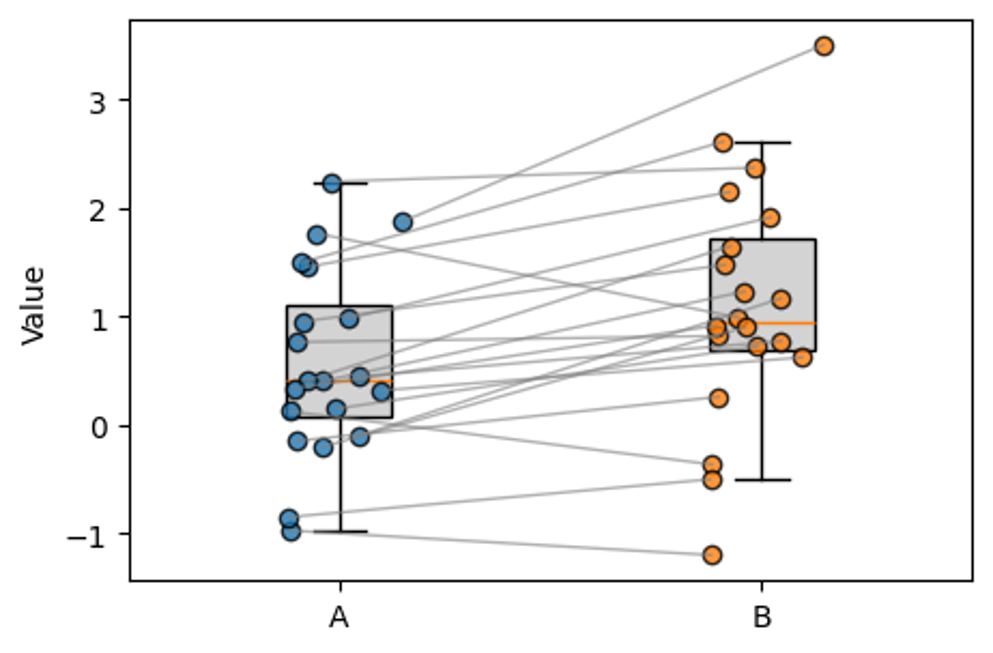
1つの Axes に複数の描画要素を重ねる 形になります。軸のスケールは共有しているため、同じ値基準で比較できます。
import numpy as np
import matplotlib.pyplot as plt

# -----------------------------
# Paired data: boxplot + strip chart + connecting lines
# -----------------------------

np.random.seed(0)

# 1. Prepare paired data (A and B)
n = 20
values_a = np.random.normal(loc=0.0, scale=1.0, size=n)          # group A
values_b = values_a + np.random.normal(loc=0.5, scale=0.5, size=n)  # group B (slightly higher on average)

# 2. Basic settings
x_a = 0
x_b = 1
jitter_width = 0.15  # horizontal jitter range for strip chart

# Jitter for each pair (shared between A and B so lines look neat)
jitter = (np.random.rand(n) - 0.5) * 2 * jitter_width

fig, ax = plt.subplots(figsize=(12 / 2.54, 8 / 2.54))

# 3. Boxplots for A and B
ax.boxplot(
    [values_a, values_b],
    positions=[x_a, x_b],
    widths=0.25,
    showfliers=False,                    # hide outlier markers for clarity
    patch_artist=True,                   # allow facecolor
    boxprops={"facecolor": "lightgray"},
    zorder=1
)

# 4. Strip chart (scatter with jitter) for A and B
ax.scatter(
    np.full(n, x_a) + jitter,
    values_a,
    color="tab:blue",
    edgecolors="black",
    alpha=0.8,
    label="A",
    zorder=2
)

ax.scatter(
    np.full(n, x_b) + jitter,
    values_b,
    color="tab:orange",
    edgecolors="black",
    alpha=0.8,
    label="B",
    zorder=2
)

# 5. Connecting lines between paired points
for xa, xb, ya, yb, j in zip(
    np.full(n, x_a),
    np.full(n, x_b),
    values_a,
    values_b,
    jitter
):
    # use the same jitter j for A and B to keep the line visually clean
    ax.plot(
        [xa + j, xb + j],
        [ya, yb],
        color="gray",
        alpha=0.6,
        linewidth=1,
        zorder=3
    )

# 6. Cosmetics
ax.set_xticks([x_a, x_b])
ax.set_xticklabels(["A", "B"])
ax.set_xlim(-0.5, 1.5)
ax.set_ylabel("Value")

fig.tight_layout()
plt.show()